
From Dull to Dynamic: 5 Ways to use Red in Your Space
- Kelley Nash
- Feb 3, 2024
- 3 min read

In the realm of interior design, the significance of color cannot be overstated. It has the power to transform a mundane space into a dynamic, personality-filled haven. Among the vast spectrum of colors available, red stands out as a vibrant and energetic choice that can breathe life into any room. As trends change, 2024 is going to add much needed color into our white and beige spaces. In this article, we will explore 5 ways to add red to your space without changing your entire home decor.

@melaniejadedesign
Choosing the Right Shade of Red:
Warm vs. Cool Reds
The journey to a dynamic space begins with selecting the right shade of red. Reds can be broadly categorized into warm and cool tones. Warm reds, such as scarlet and crimson, exude energy and create a cozy ambiance. On the other hand, cool reds, like raspberry and burgundy, offer a more subdued, sophisticated look. At this point, we are seeing mostly warm brown-reds in spaces. However, I see bright reds and cool burgandy's in our future of design. Consider your space's intended mood and existing color palette when making your choice.

Decor Pad
Considering the Space's Lighting
Lighting plays a pivotal role in how red is perceived in a room. Natural light enhances the warmth and vibrancy of red, while artificial lighting can slightly alter its appearance. Before committing to a shade of red, observe how it behaves under different lighting conditions in your space. ALWAYS test your paint swatch with a white background and observe how it performs throughout the day. Colors look so different in morning, noon and evening light!

Jaipur Living
Red as an Accent Color:
Statement Pieces
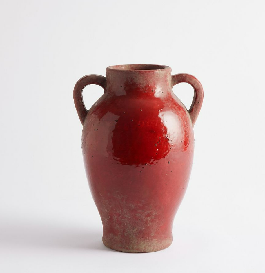
One of the most effective ways to infuse red into your space is by incorporating it as an accent color in your furniture. A red rug or a set of crimson dining chairs can instantly become the focal point of a room. These bold choices not only add character but also create a sense of warmth and excitement in an otherwise neutral environment.

Red Accessories and Decor
For those hesitant about fully committing to red, accessories and décor items offer a subtle introduction to this dynamic hue. Red throw pillows, curtains, or even branches and leaves can inject life and vibrancy into your space. The beauty of using accessories is the flexibility to swap them out seasonally or as your design preferences evolve.
Red Walls and Textures:
Creating Focal Points
If you're ready to make a daring statement, consider painting one or more walls in your space red. Red accent walls are a powerful design choice, instantly drawing the eye and creating a dynamic focal point. To enhance this effect, strategically place artwork or furnishings against the red backdrop to amplify the visual impact.

Vivir Design
Paneling and Cabinetry
For a touch of uniqueness, try using red on a paneling treatment. Beadboard becomes elevated when painted a warm red. Even cabinetry can look so sophisticated in a moody red or burgundy. Add light accessories, in whites, creams and pastels, to stand out against this darker color. Brass accents work perfectly against dark reds.

@westofmain
Red in Art and Décor:
Red Artwork
Integrating red into your space can also be achieved through art. Red-themed paintings, sculptures, or photographs can serve as captivating focal points. These pieces not only introduce color but also tell a story and provide a deeper connection to your space's design.

Studio McGee
Incorporating Red Patterns
Another creative way to utilize red is by incorporating it into patterns. Red can be integrated into wallpapers, fabrics, and area rugs through intricate designs and motifs. Whether it's a floral pattern or a geometric arrangement, red patterns can infuse a sense of dynamism into any room.

The color red has the power to transform your living space from dull to dynamic. By choosing the right shade, using red as an accent color, experimenting with red walls and
textures, and incorporating red art and décor, you can create a space that radiates energy and personality. Embrace the boldness of red and watch your space come alive with vibrancy and style.
As always, do what you love.
Kelley


jd88 vip mình cũng chỉ ghé thử vì thấy bạn bè nhắc hoài, kiểu tò mò xem giao diện ra sao. Vào cái là thấy trang bố cục khá thoáng, nội dung chia thành từng khối nhìn phát hiểu ngay chỗ nào là thông tin chính, không phải căng mắt đọc. Mình lướt nhanh thôi chứ không đào sâu, nhưng cảm giác điều hướng ổn: menu để khá dễ thấy nên bấm qua lại không bị lạc hay phải tìm. Mấy phần hiển thị dạng bảng cột nhìn gọn, chữ vừa phải nên đọc đỡ mỏi. Nói chung trải nghiệm kiểu nhẹ nhàng, không rối rắm như vài trang khác mình từng xem, nhất là cách họ chia khối nội…
bonoclub.com me metí un rato para ver qué tal y la verdad es que está bastante aterrizado, sin marearte. Lo que más me sirvió fue que en el tema de iniciar sesión no se van directo a “culpa tuya”, sino que te hacen revisar cosas típicas que pasan: por ejemplo, que la contraseña guardada ya no sea la buena o que el navegador se quede con una sesión rara. Eso lo he sufrido mil veces y acá lo dicen tal cual, sin drama. También se nota un toque de “hazlo seguro” pero sin sermón, más como recordatorio rápido. En general se lee fácil porque no es un muro de texto, está todo en pedacitos cortos y con títulos bien al…
Bài viết khá hữu ích, cảm ơn bạn đã chia sẻ. Mình cũng hay theo dõi thống kê XSMB mỗi ngày nên muốn có chỗ tổng hợp cho dễ tra lại, khỏi phải tìm nhiều nơi. Bài này mình cũng lưu lại để đọc lại khi cần. Ai quan tâm số liệu cập nhật theo ngày thì ghé xem http://vetstate.ru/forum/?PAGE_NAME=profile_view&UID=285559
https://qqs8889.com/ mình thấy người ta nhắc hoài nên bấm vô coi thử cho biết chứ cũng không định ngồi lâu. Vừa vào cái là thấy giao diện làm khá “dễ thở”, chữ không bị dồn dập nên lướt nhanh vẫn nắm được mình đang ở đâu. Mình thích kiểu họ chia nội dung thành từng khối rõ ràng, nhìn qua là biết phần nào là thông tin chính, phần nào là phụ, không phải căng mắt tìm. Cái menu cũng đặt chỗ dễ thấy nên chuyển qua lại giữa mấy mục không bị lạc, cảm giác thao tác khá mượt. Nói chung chỉ xem sơ sơ thôi mà vẫn thấy bố cục canh hàng gọn và các khối nội dung…
Sau khi thấy Sc88 bù link nha xuất hiện trong phần gợi ý, mình mở vào xem thử để tham khảo cách họ xây dựng giao diện. Điều mình chú ý đầu tiên là các khu vực trên trang được sắp xếp khá hợp lý, mỗi phần đều có tiêu đề rõ ràng nên việc theo dõi nội dung không gặp nhiều khó khăn. Cách phân chia danh mục cũng khá trực quan, giúp người dùng mới nhanh chóng xác định được khu vực cần truy cập. Trong quá trình trải nghiệm, tốc độ tải trang ổn định, thao tác chuyển đổi giữa các mục diễn ra mượt và không gặp tình trạng giật hay chậm phản hồi.